
︎︎︎ Back
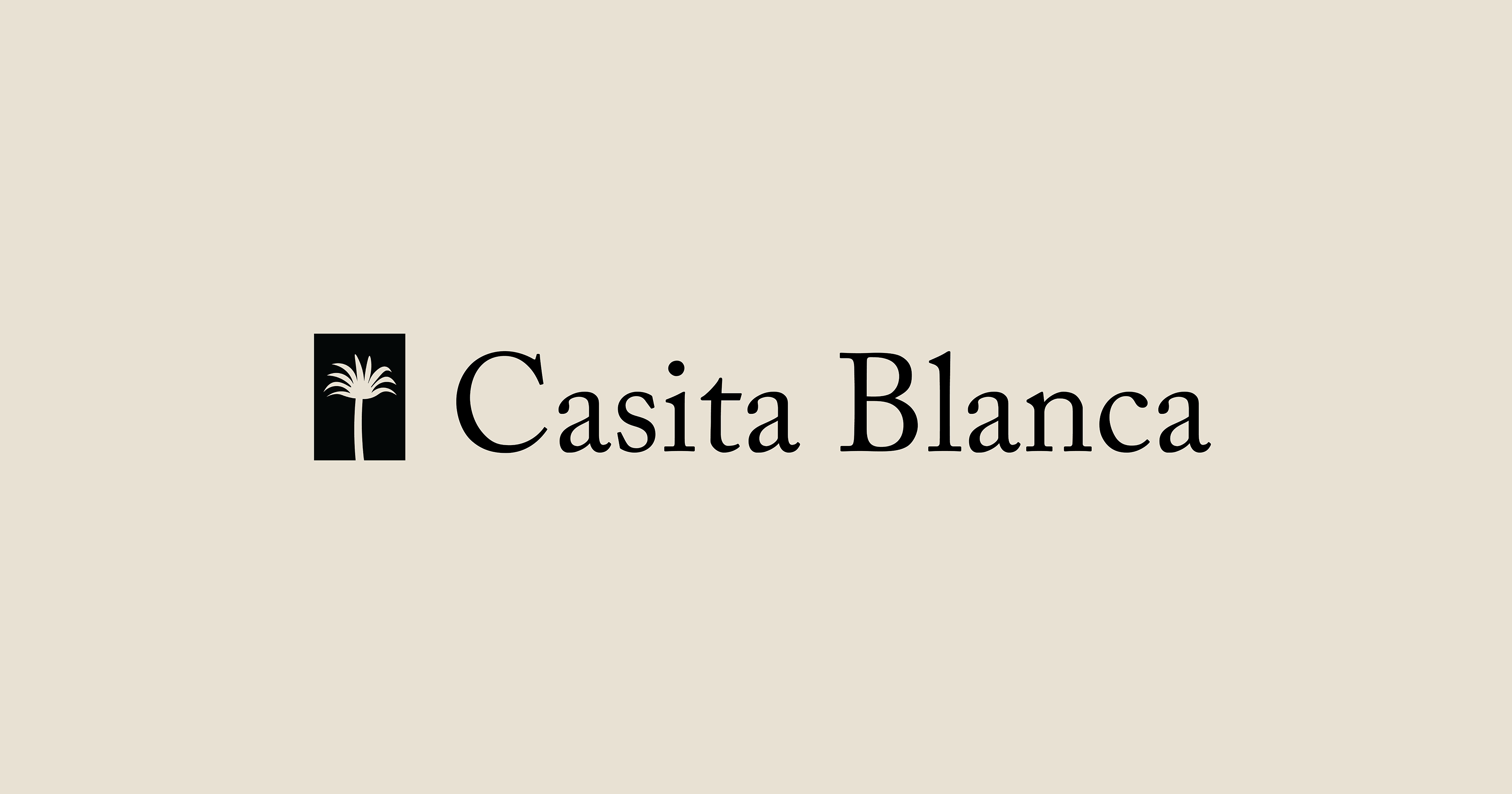
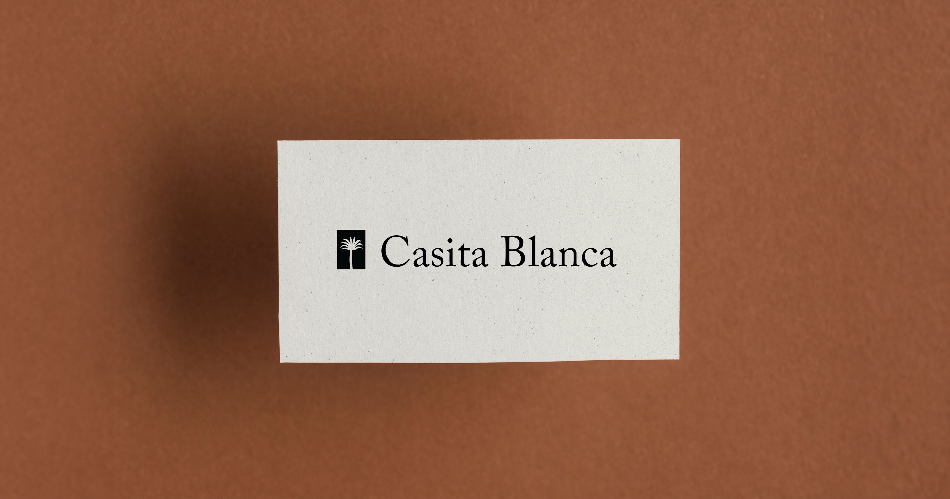
Casita Blanca
design, prototypingSummary
I designed a logotype for a rental property located in Charleston, South Carolina.


Project Type
Client Project
Role
Design
Team
Carter Hamilton (PM)
Tools
Adobe Creative Suite
Duration
1 month
Background
Casita Blanca is a rental property located in Charleston, South Carolina. The owner and property managers reached out to formulate an official brand for the rental property. They wanted this property to have a luxurious feel for better public appeal. they will be turning this property into an Airbnb in the next year; therefore they want to curate a specific look.
Objective
My task was to create a logotype for the rental property based off of an inspiration deck, as seen to the left. The team was looking for a brand that conveyed simplicity, elegance, expensiveness.
Insights and Process
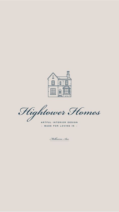
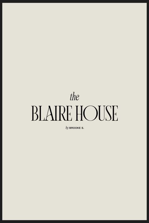
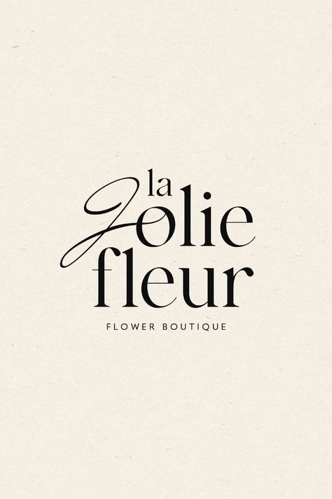
I began the design process by anaylzing the inspiration images that were provided by the team. I noticed prominent similarities like cursive, serif, and tall letter forms. They all seemed type or illustration focused, and they had a light pale background that made sure the type was front and center.
I began experimenting with type by hand lettering ‘Casita Blanca’ with multiple writing utensils in multiple ways. For me, elegance and uniqueness is always an outcome of an intentional, hand tailored cursive type. I also included some type variations to show the team.
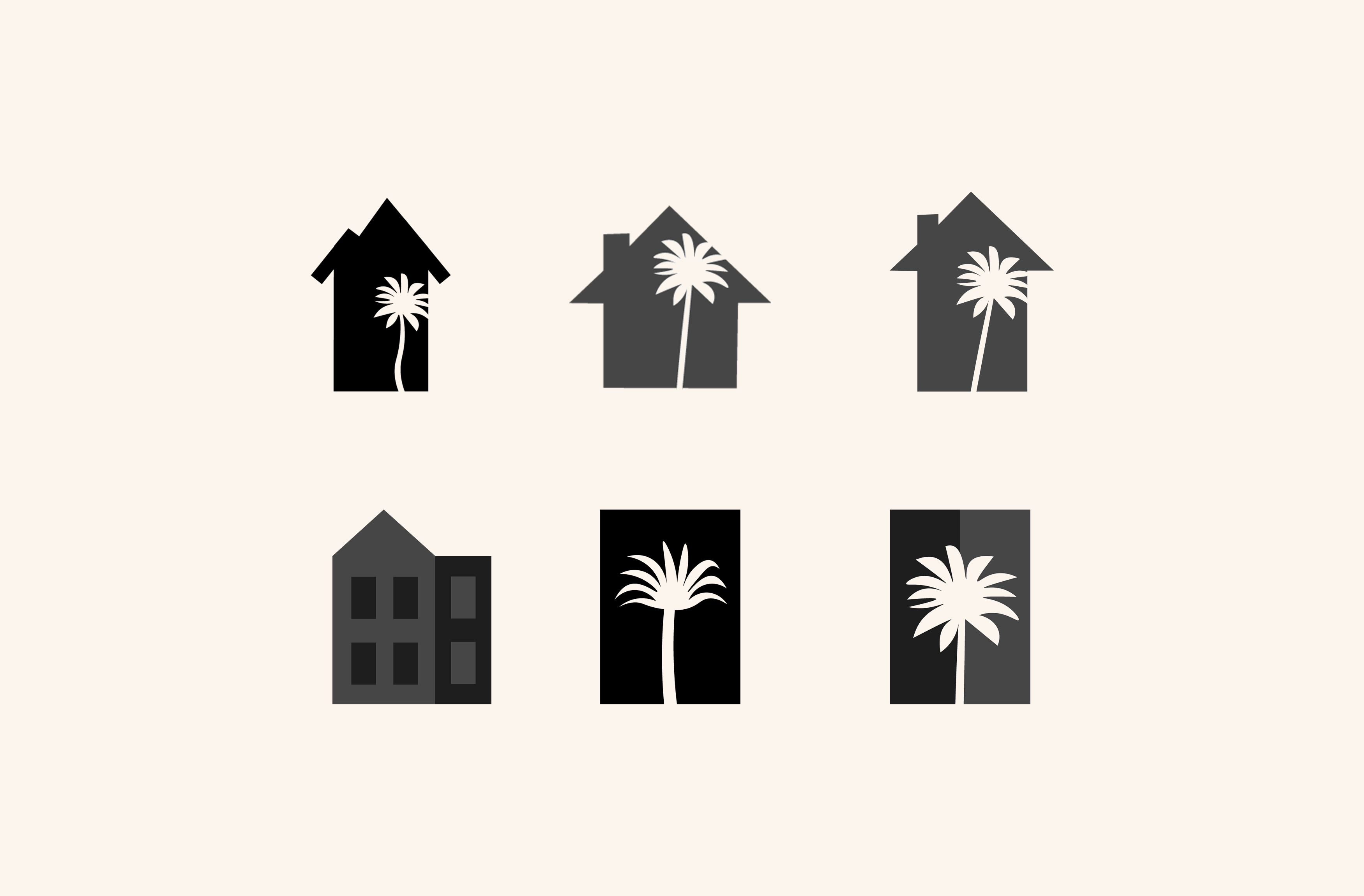
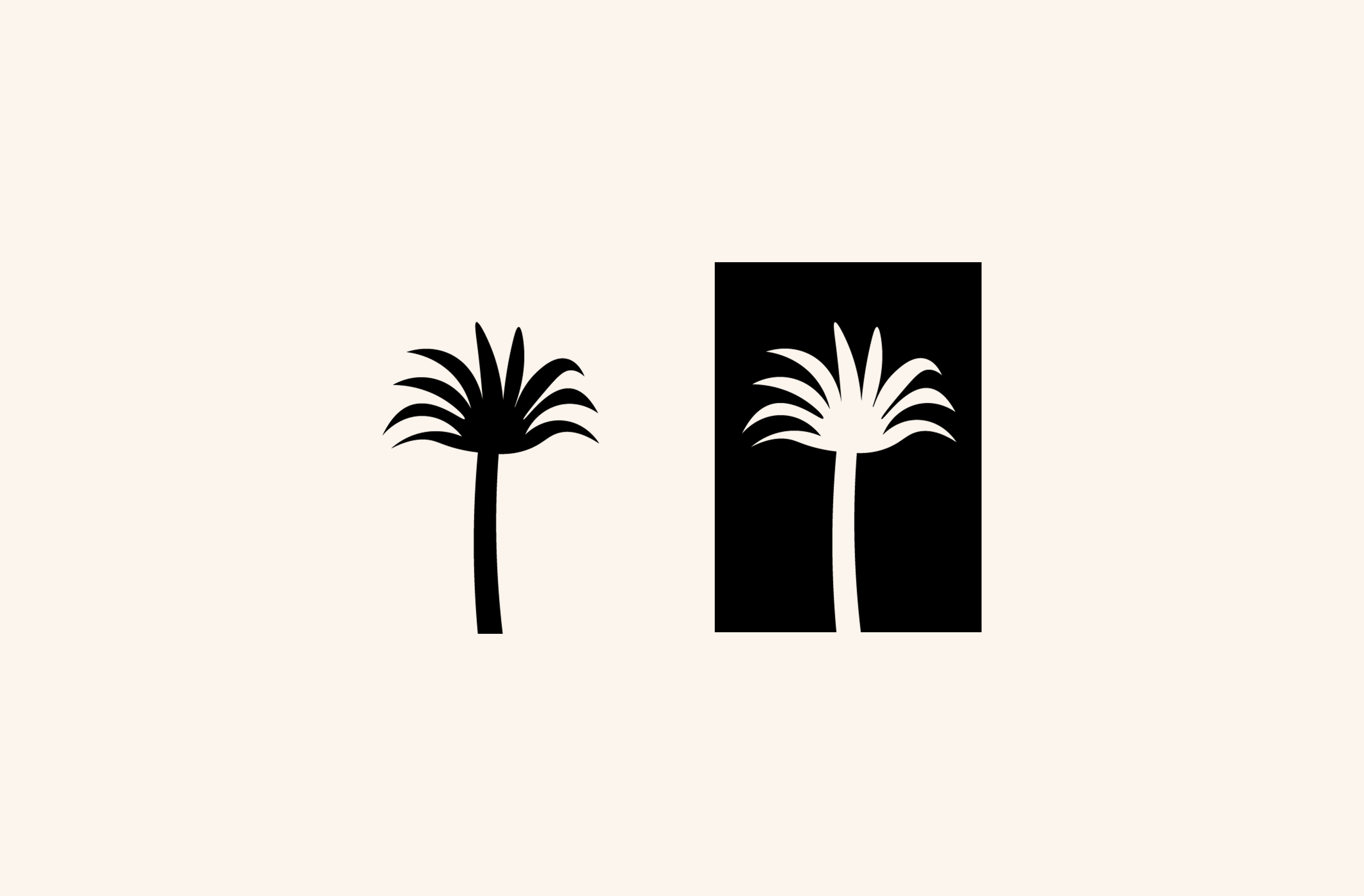
For the icon imagery, I wanted to include a form of a house with a cut out of a palm tree to indicate our coastal town. I envisioned that it could even be debossed or embossed on a printed medium. I presented a few options to the team in hopes that it would benefit the logo type to have an icon.
Below is an evolution of lettering, type, and icon experiments for Casita Blanca.


Deliverables
